Google Experiments With New Site Name and Favicon Layout in Search Results
A New Look for SERPs: Google’s Interface Experiment
Google is currently testing a significant visual shift in how it displays website identities within its Search Engine Results Pages (SERPs). This new experiment focuses on the arrangement of the sitename and favicon, aiming to streamline the presentation of brand information for users.
Understanding the Visual Shift
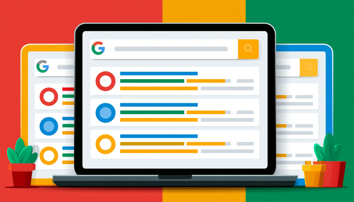
In the current standard layout, Google typically displays the favicon in a way that spans two lines, with the site name appearing on the first line and the URL breadcrumb appearing directly beneath it. This vertical stacking is the familiar interface millions of users interact with daily.
The new test, however, shifts these elements into a single, horizontal line. In this proposed layout, the favicon is followed by a bolded site name, which is then immediately followed by the URL. This streamlined approach places the essential brand markers in a compact row before the user reaches the main title, snippet description, and sitelinks.
Widespread Testing and Industry Observations
The test has been spotted by various SEO professionals and search analysts, suggesting that this is a widespread experiment rather than a localized glitch. Industry experts have noted that the bolding of the site name—seen on everything from global giants like Apple to smaller local entities—could be a strategic move to increase brand recognition.
By emphasizing the site name in bold and placing it on a single line, Google may be attempting to improve the “scannability” of search results, allowing users to identify trusted sources more quickly.
What This Means for Branding and SEO
While this is a visual interface change rather than an algorithmic update, it carries implications for digital branding. A more prominent, bolded site name can serve as a strong indicator of brand association and search recognition. For website owners, ensuring that site names and favicons are correctly implemented via schema markup and standard HTML becomes even more critical as these elements take center stage in the user experience.
Conclusion
Whether Google decides to roll this out globally or revert to the stacked layout remains to be seen. However, the move highlights Google’s ongoing commitment to refining the SERP layout to maximize clarity and brand visibility in an increasingly crowded digital landscape.